![Logo (Black Text)-1.svg]](https://support.haystackteam.com/hubfs/Logo%20(Black%20Text)-1.svg)
Your Group is more than just a folder; it’s a digital headquarters for your team. By customizing your visual assets, navigation tabs, and dashboard cards, you ensure that members can find exactly what they need while enjoying a branded experience that fits your team's unique culture.
Prerequisites
-
Group Owners & Workspace Admins: Have full access to customize these settings.
-
Permissions: By default, these options are available to group owners. If you are an admin and wish to restrict this to "Admin Only," you can adjust these settings within the Permission Settings tab of your group.
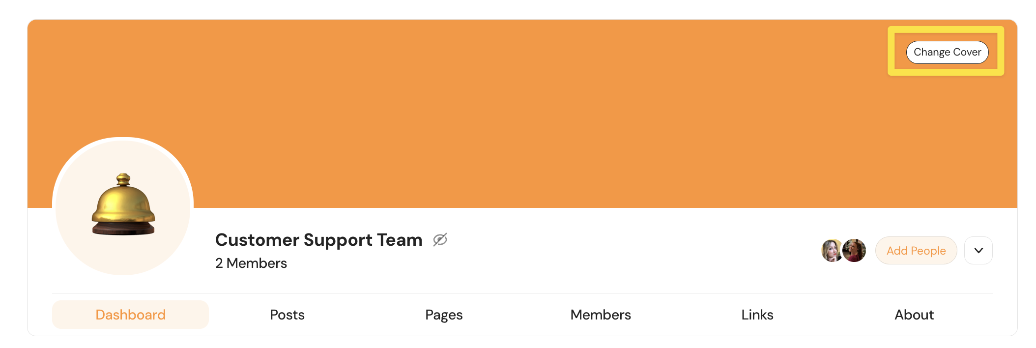
Customizing Visual Assets
Your group has two main visual components: the Cover Photo and the Avatar.
1. Update the Cover Photo
Hover over the large banner at the top of your group page and click Change Cover.
-
Upload: Use a custom image from your computer. Visit our
-
Gallery: Choose from a curated set of images provided by your workspace admins.
-
Unsplash: Search a massive library of high-quality stock photography.
2. Update the Group Avatar
The avatar is the smaller icon that appears in the group list and on the dashboard.
-
On your group page, click the carort button and select Settings.
-
Under General Settings, look for the Group Icon section.
-
You can Change it to an emoji, a custom photo, or delete the current selection to start fresh.

Configuring the Group Dashboard
The dashboard is the "front page" of your group. It’s blank by default, so we recommend adding cards to make it functional.
Adding and Populating Cards
-
Click + Add a Card on your group dashboard.
-
Select from the Card Library (e.g., Recent Posts, Upcoming Events, or Resources).
-
Don't panic if it looks empty! If you start adding cards before your group has any content (posts, pages, events, or links), many of your cards will appear blank. This is perfectly normal—simply start adding content to the group, and your cards will automatically populate.
Setting Up and Sizing
To set up a card once it's on your dashboard, click the three-dot button in the card header. Here, you will find options for:
-
Sizing: Choose between small, medium, or large layouts.
-
Setup: Configure specific filters, settings, content, or data sources for that card.

Removing Cards
To remove a card, click the three-dot button in the card's top right-hand corner and select Delete.
Warning: Once a card is deleted, it cannot be restored. Move carefully when cleaning up your dashboard!
Managing Group Navigation
If your group doesn't use certain features (like Events), you can hide those tabs to keep the interface clean.
-
Go to Settings > Custom Group Nav.
-
Toggle Off any tabs you don’t need.
-
Reorder Tabs: Drag and drop the tabs to change their sequence. The top-listed item in this menu will become the Home (landing page) for your group.

Best Practices
-
Choose High-Res Images: For cover photos, use clear images that aren't too "busy" so the group name remains readable.
-
Keep Nav Simple: If you aren't using a specific feature yet, hide the tab! You can always toggle it back on later.
-
Dashboard Logic: Place the most important cards at the top of the dashboard so users don't have to scroll for vital info.
Need More Help?
Want to dive deeper into custom integrations for your dashboard?
-
Chat with us: Use the support chat icon on this page.
-
Email us: Send your questions to support@haystackteam.com.
Keywords: Group Dashboard, Navigation, Cover Photo, Avatar, Custom Branding, Dashboard Cards, Group Settings, UI Customization, Unsplash, Embedding Tools